Christian Coleman DP Reel from RF Teller on Vimeo.
Wednesday, April 28, 2010
Statement and Reel
When footage of the moon landing began to reach America, poet Brian Turner's dad said, "Someday they'll send a poet and we'll find out what it's really like..." I think that's very true but not just for poetry. I think it's true for all art. I want to convey drama and tension using lights and camera movements to impart on the audience what the scene is really like. Shadows are as important to me as light and sometimes more important. What is unseen can be as powerful as what is seen and I want to use that to make compelling images. Also, I believe that no matter how outlandish the fiction, the emotions must be true, so I seek to tell every story as truthfully as possible.
Monday, April 19, 2010
Sunday, March 28, 2010

Man...planning to direct is stressing me out. I'm directing a modern envisioning of shakespeare and so I've been drawing a lot from Romeo + Juliet with Leonardo DiCaprio because that movie's gold. The picture above is a "sword" from the movie.
I've been doing some location scouting, trying to find the right place but don't think I've found it yet. I'm working on a shot list but its going to have to stay pretty general until I'm certain of where I want to shoot.
I know I want to shoot a low-key scene with lots of shadows but I can't plan my lighting without a location. So i guess, I'm pretty hampered by my lack of location but I'm fixing it.
More soon...
Sunday, March 7, 2010
Slash Zombies
http://www.shortfilms.com/video/546/SLASH-ZOMBIES
I don't know if "Slash Zombies" is my favorite online short but its definitely one I like. There is some pretty impressive camera work in here. There is a lot of racking focus on parts to show a character's confusion or frustration. There is a lot of quick zooms to show intensity. You never forget that you're watching a film, the camera work almost breaks the fourth wall in a sense. Since these kinds of movements are throughout, it works; such as when the camera flips upside down then pans to the next character. The girl is incredibly lost and the camera suddenly flips her on her head. This is very overt visual storytelling but it works. The whole thing is very high-key and color corrected (or filtered, I'm not sure). The look is a little futuristic because of the color but not distracting. Plus, I love zombies and I love the middle east.
I don't know if "Slash Zombies" is my favorite online short but its definitely one I like. There is some pretty impressive camera work in here. There is a lot of racking focus on parts to show a character's confusion or frustration. There is a lot of quick zooms to show intensity. You never forget that you're watching a film, the camera work almost breaks the fourth wall in a sense. Since these kinds of movements are throughout, it works; such as when the camera flips upside down then pans to the next character. The girl is incredibly lost and the camera suddenly flips her on her head. This is very overt visual storytelling but it works. The whole thing is very high-key and color corrected (or filtered, I'm not sure). The look is a little futuristic because of the color but not distracting. Plus, I love zombies and I love the middle east.
Monday, February 22, 2010
So, I picked to analyze a scene from Troy. The movie's based on the Iliad. Achilles travels to Troy to fight in the war Menelaus starts because Paris stole his wife, Helen. Pretty straightforward. This is the scene where Achilles and Hector fight.

This is a screencap from Troy. This is a set-up shot of Achilles (Brad Pitt) facing Hector (Eric Bana). I like this shot because its not over-done. Its not an XCU or anything like that. Its a simple CU with Achilles a little bit to the right of center so we focus on him. The camera doesn't move and he doesn't move either- all intensity.
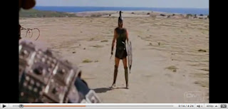
This shot is some more set-up to the fight. There's alot of setup here, almost as long as the fight itself. I think this was done to obviously increase the tension and to express the magnitude of the showdown. There's a super long depth of field behind Achilles to amplify the fact that he's all alone out there. There's no army behind him or anything; just him and his sword. In the reverse-shot, there is a shorter depth of field behind Hector and we see the wall of Troy, his family, his friends all behind him. He's not alone, he has things to live for. This foreshadows the fact that he's going to die.
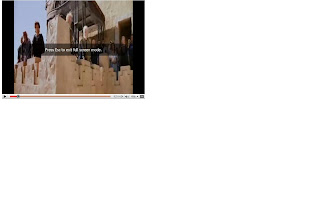
This shot shows the people watching the fight but i think it is a visual cue to the actual audience of the film. Everyone is craning to see the fight, building anticipation, and i think that translates to the viewer. Bright, even lighting translates the feeling of it being a hot day well.
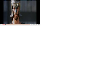
This shot is the reverse-shot from the Achilles one. What's interesting is that Achilles is the villain (somewhat) and Hector is the hero (somewhat). The director places Hector on the left of the frame and achilles on the right. I think that perhaps he's playing with the old hollywood convention that the villain goes on the left to unconsciously make us consider who exactly is the hero or the villain.
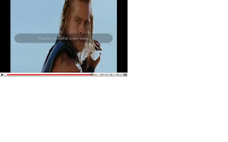
Achilles about to deliver the death blow to Hector (uh-oh, spoiler). He's got bright light on his face, his eyes are easily visible and he's up high-triumphant. He's still slightly to the right of frame so we focus on him. He's looking off to the left with look-room over his shoulder. in the reverse-shot, Hector is to the left, so there's continuity. Mostly this shot shows Achilles' dominance as he looks down and only the sky is behind him.
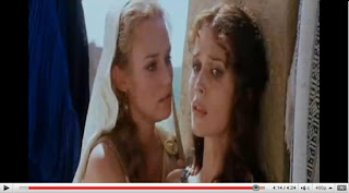
This is Helen (the reason for the war) on the left, trying to comfort Hector's wife after Hector is killed. Helen's on the left as if she's the villain. Her eyes are somewhat hidden by make-up and some shadow, so we can't quite connect with her. Andromache, on the other hand, is almost looking into the camera and there is good light on her eyes. We see all the pain in her eyes and we connect with her sorrow.

This is a screencap from Troy. This is a set-up shot of Achilles (Brad Pitt) facing Hector (Eric Bana). I like this shot because its not over-done. Its not an XCU or anything like that. Its a simple CU with Achilles a little bit to the right of center so we focus on him. The camera doesn't move and he doesn't move either- all intensity.

This shot is some more set-up to the fight. There's alot of setup here, almost as long as the fight itself. I think this was done to obviously increase the tension and to express the magnitude of the showdown. There's a super long depth of field behind Achilles to amplify the fact that he's all alone out there. There's no army behind him or anything; just him and his sword. In the reverse-shot, there is a shorter depth of field behind Hector and we see the wall of Troy, his family, his friends all behind him. He's not alone, he has things to live for. This foreshadows the fact that he's going to die.

This shot shows the people watching the fight but i think it is a visual cue to the actual audience of the film. Everyone is craning to see the fight, building anticipation, and i think that translates to the viewer. Bright, even lighting translates the feeling of it being a hot day well.

This shot is the reverse-shot from the Achilles one. What's interesting is that Achilles is the villain (somewhat) and Hector is the hero (somewhat). The director places Hector on the left of the frame and achilles on the right. I think that perhaps he's playing with the old hollywood convention that the villain goes on the left to unconsciously make us consider who exactly is the hero or the villain.

Achilles about to deliver the death blow to Hector (uh-oh, spoiler). He's got bright light on his face, his eyes are easily visible and he's up high-triumphant. He's still slightly to the right of frame so we focus on him. He's looking off to the left with look-room over his shoulder. in the reverse-shot, Hector is to the left, so there's continuity. Mostly this shot shows Achilles' dominance as he looks down and only the sky is behind him.

This is Helen (the reason for the war) on the left, trying to comfort Hector's wife after Hector is killed. Helen's on the left as if she's the villain. Her eyes are somewhat hidden by make-up and some shadow, so we can't quite connect with her. Andromache, on the other hand, is almost looking into the camera and there is good light on her eyes. We see all the pain in her eyes and we connect with her sorrow.
Friday, February 12, 2010
Sunday, January 31, 2010
Thank you for not smoquing
Who knew there were so many types of filters. I spent the better part of an hour trying to understand all of the different camera filters.
so cranking up the gain makes everything look ultra-realistic and serious...i tried it out in my 'run n gun' (that's right i said gun) shoot but i don't think it quite worked out for me like i hoped.... "it did not have the effect Longshanks desired".
so i've been watching movies with this new 'eye', like i'm looking for how scenes are shot and lit and stuff like that and i just can't get over how much i like the look of James Cameron's the Terminator. Adam Greenberg was DP on the first and the second movies, but i think the look has a lot to do with James Cameron. It's got the same low angles; stuff getting crushed; realism; that Aliens has and Adam Greenberg wasn't DP on that one. I don't know if there's a name for that sort of conceptual look but i need to figure it out
Subscribe to:
Comments (Atom)